What’s in a Chart?: How Students Can More Effectively Approach Data Analysis Problems
Do you ever look at a chart and feel like the numbers jumble together? Have you ever taken a glance at a graph and had no idea what’s going on? Even if you’re confident in your ability to read the data, there might be a few things you’re missing, especially when it comes to comparing data from multiple sources. Here are a few tips you can use to approach reading data from charts and graphs more effectively.
Understand the use of each type of graph
The way you are presented data matters. Each kind of chart serves a different purpose, telling you to focus on a different part of the data. Just by looking at the type of chart or graph, you should have a clue to what material is being presented and what comparisons you are being asked to make. There is a wide variety of ways to show data – too many to count – so we’ll only focus on the most common ways you should see the data presented in classes and tests.
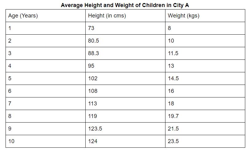
Chart/Table
What they’re best for:
- Comparing values/amounts between different categories at one point in time.
Pay attention to:
- The names of each category.
- Any units of measurement given (make sure they’re all the same).
- The overall direction of the data/relationship between categories. As one category’s numbers increase, what happens to the numbers in the other categories? Do they increase as well? Decrease? No relation?
Watch out for:
- Units of measurement.
- Comparing multiple categories.
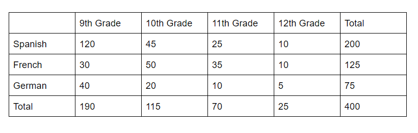
Frequency Table
What they’re best for:
- Comparing how many times a certain event happens across multiple categories.
Pay attention to:
- The places where the columns and rows meet. Each box represents the amount of times that event happens for the categories listed on the column and row.
- For example, in the table above, there are 20 10th graders who take German. This group makes up 27% of all German students (20/75), 17% of all 10th graders (20/115), and 5% of all language students (20/400).
Watch out for:
- Pay close attention to what the question asks you. Sometimes they ask you to compare a box to the total number of events, sometimes to only the total events in that category, or sometimes between different categories.
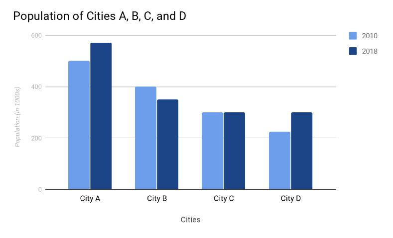
Bar Graphs
What they’re best for:
- Comparing different amounts across categories at one point in time.
Pay attention to:
- The margins. Make sure you read carefully the units for each measurement. For example, you may see the number 500 on the side, but there’s additional text that says “in 1000s.” That means the actual measurement is 500,000.
Watch out for:
- The labels, especially when multiple bars are shown for the same category like in the graph above. In this graph, each city’s population is shown for two different years (shown by the color coding and labels to the top right).
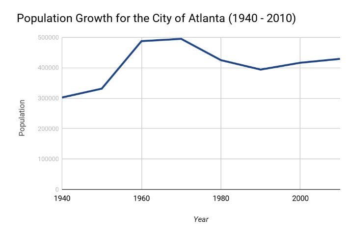
Line Graph
What they’re best for:
- Comparing how the values in one category (unless there are multiple lines) changes over a period of time.
Pay attention to:
- The general trend of the line. Is it going up? Down? Where are the parts where it increases or decreases the most (greatest change)?
Watch out for:
- Questions that ask about rate of change are asking you to pay attention to the slope of the line in whatever period is specified. In the graph above, the rate of change in Atlanta’s population was greatest between 1950 – 1960. Likewise, the following decade (1960 – 1970) had the smallest change as its slope is the smallest/most shallow.
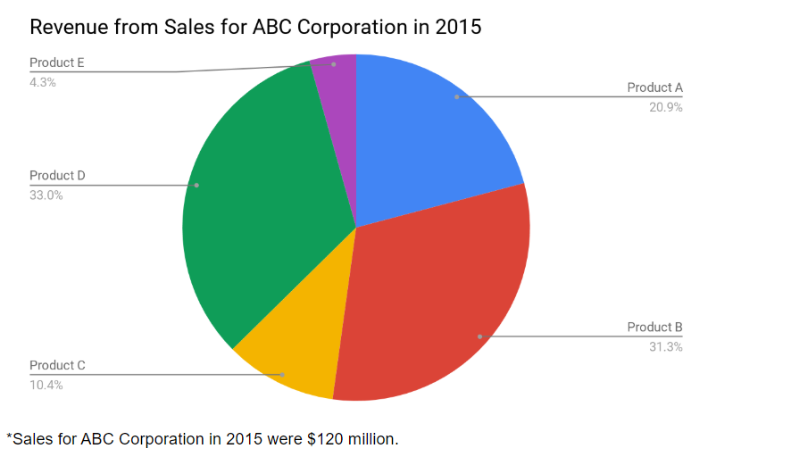
Circle Graph/Pie Chart
What they’re best for:
- Comparing the part that different categories take up of a larger whole.
Pay attention to:
- The categories.
- The percents/the size of each slice of the pie.
Watch out for:
- Pay close attention to the question if you’re asked to find the percentage for multiple categories.
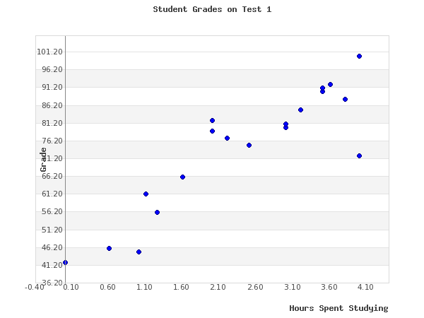
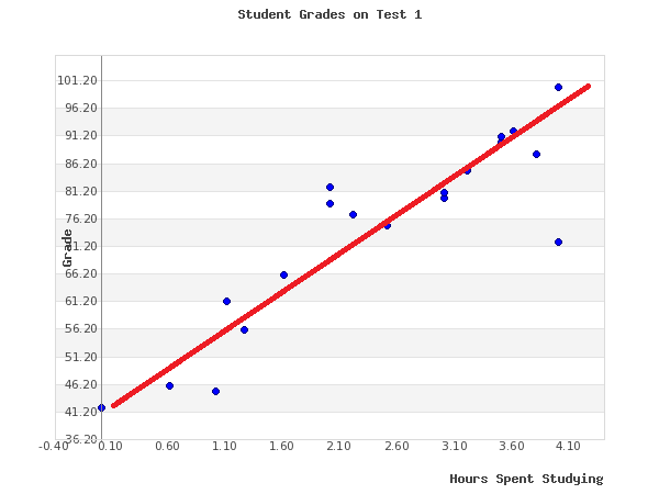
Scatter Plot
What they’re best for:
- Finding an average trend for data.
- Showing the concentration/frequency of specific events.
- Showing where the outliers (data that doesn’t fit the overall trend) are.
Pay attention to:
- How closely or not the dots are grouped together. The closer together, the more the stronger the trend.
- The line of best fit/trendline. If not already drawn, try to draw a line through the dots on the graph. You want it to be a straight line that touches as many dots as possible. If it can’t touch most or all of the dots, you also want to make sure that a near equal amount of dots are above and below your line of best fit.
- Outliers – points on the graph that are far/farthest from your line of best fit.
Watch out for:
- If you’re asked to calculate the slope of the data or estimate another point on the graph, you need to be careful to draw a reasonably good line of best fit.
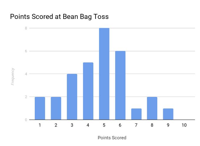
Histogram
What they’re best for:
- Comparing how often a specific event occurs.
Pay attention to:
- The frequency of each event.
- The grouping of the data. In the histogram above, do more people have higher scores or lower scores?
Watch out for:
- If you’re asked to find the average of the data in a histogram, you can’t just add up the numbers on the x and y axes. Keep in mind that “frequency” means how many times an event has happened. In the chart above, the frequency of five points is 8. That means eight different people scored a 5. When you write that data down, it looks like (5 + 5 + 5 + 5 + 5 + 5 + 5 + 5) or (5 x 8). If you need to find the average of the entire set of data, you need to do this for every event and then average the total you get from adding/multiplying.
- To average the data in the chart above, you should do (1 x 2) + (2 x 2) + (3 x 4) + (4 x 5) + (5 x 8) + (6 x 6) + (7 x 1) + (8 x 2) + (9 x 1) + (10 x 1) = 146 and divide by the number of people (add up the frequencies), which is 31. So 146/31 gives us an average score of 4.7 for this game.
Read the title and the margins
A lot of people forget to do this and focus too much on the lines, bars, and sections of different charts. This might be the most important part of reading the data properly. After all, without looking at the title of the chart, how would you know what information is being compared? Without reading the margins, how can you accurately tell how each category is being measured? Read the titles and margins carefully.
Always look at units of measurement
Pay attention to units of measurement. Many tests like to bait and switch you whenever possible. If a unit of measurement is mentioned, make sure what the question asks you for is the same data/unit that is shown on the graph. If not, you may need to convert to some other unit.
Compare similar categories
If multiple graphs are given, it’s common that all the information requested may not be on one graph or chart. You may need to compare and contrast the data across different charts. Sometimes it may not even be the same kind of chart or graph. In this case, pay special attention to the labels on the data. You will often find this information in the margins/legends for the graph. If the same label isn’t used across the different graphs, the next step is to look for additional information that tells you more about the similarities between categories or how they’re measured.
Look at trends and patterns
Look for trends and patterns. Is the data increasing? Decreasing? Maybe there’s some other pattern. Common questions you might come across include “Which category is biggest/smallest,” “Which category had the largest/smallest increase or decrease,” “Which event happened the most,” “Which category is largest/smallest,” and so on. All of these questions ask you to look at how the data changes across one or more categories.
What is the question actually asking?
You’ve probably heard this bit of information a lot. Read the question carefully. Like, really carefully. There are many ways you may be asked to mix and match the data on charts and graphs, so it’s really important that you understand what the question actually asks you to find.
Charts and graphs are a very useful way to show a lot of data at once. Because so much information is represented in these graphics, it can sometimes be easy to miss a few pieces. This skill can be picked up easily; however, you just need to get more practice and familiarize yourself with the most common places to look for each type of graphic. If you need more help making sense of the data, consider working with a tutor and give us a call!
Looking for extra practice? Try our resources:
Related: ACT and SAT practice worksheets
View our resources
Strive Resources | TpT | Made By Teachers | Classful | Etsy

You may also like
-

New Group Classes From Strive Academics!
24 January, 2024 -

How to Calculate a Percent Tax or Discount Like a Pro
13 September, 2023 -

Percentages: A Simple Guide For Beginners
2 August, 2023